The opioid epidemic has reached crisis proportions with 64,000 deaths resulting from opioid overdoses in 2016. It is estimated, that opioids could kill nearly ½ million people in the US in the next decade. While the reasons for the epidemic are complex, insights can be gained by using data visualization techniques. These techniques can be used to help policy makers make better decisions about where to put resources (e.g. treatment vs. prevention) and to create a broader understanding of the underlying causes.
We at WebFirst, present a case study of how to communicate Opioid related datasets more clearly and effectively. We utilize data visualization best practices to allow the reader to gain a deeper understanding of the trends. Visualization is the field of research that studies effective communication of quantitative results by linking perception, cognition, and algorithms to exploit the bandwidth of the human visual cortex.
You’ve probably heard the term content is king – the WebFirst team is here to challenge that notion by saying "Data is King". However, raw data requires context and meaning by using visualization best practices combined with web and mobile design standards. We take our guidance from Edwin Tufte’s visualization principles, which includes items such as: show the data, encourage the eye to compare different data elements (comparative), and be closely integrated with the statistical and textual descriptions of a dataset. Designs should be simple and straightforward in order to communicate the richness of your dataset. And finally, Integrity of the data is critical – use clear and thorough labeling of the data, axes, and legends.
We can also drill down a little further by asking – what are the best ways to represent datasets on the web? We can explain complex data and comparative data very clearly to the user by combining web design and data visualization best practices.
Here is an example of Opioid prescriptions dispensed over a 12 year period:
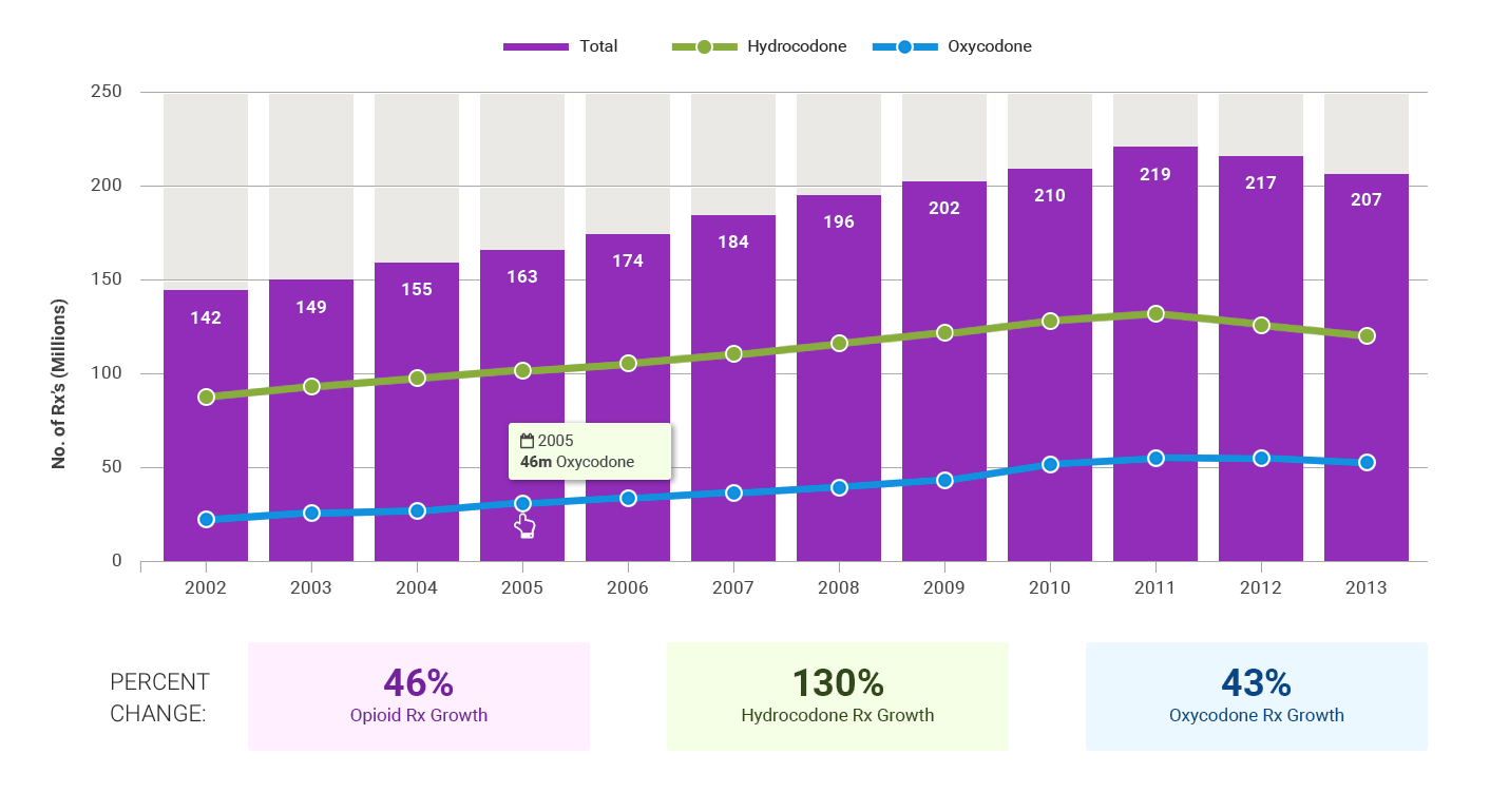 Opioid Prescriptions Dispensed by US Retail Pharmacies - Trend lines over Bar Chart (source Drugabuse.gov)
Using the above graph of opioid prescriptions made, we see that this particular graph is describing the increase in prescriptions, broken down by drug, over the past 12 years. We clearly have the year range / total at the top in large numbers with easily accessible pulldowns – where the chart redraws automatically when a user changes the year. It is also critical to provide a table view and download capabilities of the raw data.
Color is also important. For each of the drug trend lines, we use very distinct and separate colors that have good contrast with thick lines for the graph lines so they are easily readable. Hover-overs provide the absolute number of prescriptions at any given year. We train the user to understand that the colors correspond to different values (in this case two prescription opioids – hydrocodone, oxycodone).
Moreover, we match these color lines with the percent change over time numbers - these percentages are pulled out as large numbers directly under the graph. This reinforces the concept that same drug information, as well, as the percent change over time (e.g. The Oxycodone trend line is blue and the box containing “x% Change over time is blue”).
This same data can be communicated both as a trend line as a stacked bar chart:
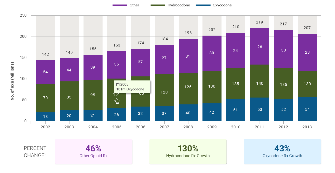 Opioid Prescriptions Dispensed by US Retail Pharmacies - Stacked Bar Chart (source Drugabuse.gov)
Also, note the use of data points for each year – there is a large spacing between years and the data points are easy to discern and easy to find in order to hover over them for more detailed data.
With this example, we’ve also checked all the visualization best practices of showing the data, using simplicity, providing comparative data and a full description of the dataset (title and axes labelled).
We have also utilized color, layout, spacing and interactive pulldown menus, to allow users to quickly see and understand the complex information (in this case state opioid death trends), obviating the need to pore over tables of raw data.
There are several open source (and other low cost) visualization tools/libraries that allow us to create these graphs easily and quickly. We like to use charting libraries such as D3.JS, Chart.JS, HighCharts JS, and Plotly.JS (all JavaScript libraries). Moreover, these charting tools can be fully integrated into your favorite Content Management System (such as Drupal or WordPress). For large datasets (big data), utilizing an architecture with node.JS and mongoDB, combined with the previously mentioned charting tools, may be more appropriate in order to achieve better performance.
When evaluating these technologies, it is important to consider the following criteria:
- Does the Chart Package offer a JavaScript library?
- Does it create the chart you’re looking for (e.g. bubble chart, funnel, etc.)
- Do you like the aesthetics – the look and design of the charts?
- Does the package provide example integrations with your Content Management System or development platform
- Price/Cloud – are you comfortable with cloud or do you require an on-premises charts server?
- Test for Mobile / Responsive Design - Take a look at your graphs on a mobile device
Once you’ve examined all of these factors (and performed the analysis on the question you are looking to answer) the actual implementation is very straightforward.
In summary, federal agencies (including FDA, CMS, HHS, Military Health (DHA), together with state and local agencies, non profits and law enforcement are working hard to combat the crisis. These agencies can leverage insights from the data to apply dollars in the areas yielding the greatest impact - reducing and hopefully eliminating Opioid Use Disorder.
WebFirst is working with the USDA and rural communities to combat the Opioid epidemic. We have developed a resource guide for USDA's Rural Development.
To find out more about how WebFirst can help your organization with data analysis and visualization needs, contact us here.